Wednesday, September 23, 2009

3D assignment that's not 3D ;(


I tried to do 3D logos but after many, many hours of trying different things, I just decided to redo last week's assignment and try to create a logo out of the heart inside the house. I was never able to create a 3D heart. I hope you all like this new version of last week's assignment...

Wednesday, September 16, 2009

2-D Assignment: Housitting Services

 
it was super hard to upload this here... I'm not a professional house sitter ... but would love to be. ;) 

Wednesday, September 9, 2009

Human Rights Ad

I didn't have time to analyze this ad according to Mediapedia's design criteria. However, I found it after I had chosen my 5 ads, and thought is was very effective.

NikeWomen Ad


The text in this add (click on it to make it larger and see the text better) shows clear legibility. The first sentence of the “poem” is bold, or highlighted to overemphasize the butt in the ad, it seems. The whole poem makes it seem like any girl/woman who uses nike could have written it and content of the text hints of empowerment and positive body image. The fact that the text is in capital letters also adds to the empowerment feeling. Font is probably new times roman (?); seems very familiar. There is no variation in font, which adds to its clarity. The colors go well together.

The ad has a tight structure: there is a wide versus narrow placement of visual elements.
Finally, in terms of composition, I am not sure about balance on this ad. It seems balanced because the poem is written in a “round” manner and there is optical equilibrium. It also looks asymmetrical. In terms of size, the poem seems a lot smaller than the butt to its left, and this was clearly done on purpose to emphasize the size of the butt as the first sentence of the poem does. There is great contrast between both elements of the ad. The poem seems to also be on the ground and the butt in the foreground, even though they are next to each other. The ad has a clear semicircular direction from top to bottom. There is lots of white space, which accentuates the butt and the poem.


This ad is very effective in grabbing the viewer's attention. Not sure how I feel about it.

Ciroc Ad


The text of this advertisement shows different fonts and thus, it makes the ad less “clean” to me. Product title is bold and in different color, stands out because it stands right under Puff Daddy. Font on bottle is not the same one that’s on ad. Not sure if it makes the ad better or worse. It seems to me that the ad also has a formal structure.

In terms of structure: the ad is balanced; there is weight on both sides (though not equal weight) and on the ground (bottom) of the advertisement. It also feels asymmetric as puff daddy’s image is heavy and it’s difficult to keep the viewer’s attention on the vodka bottle; his presence in the ad is almost as important, if not more. I believe the media has criticized the ad because it seems an ad about Puff Daddy more than about the vodka. I guess this is what make potential buyers think if they buy this vodka, they'll be like puff daddy...?

In terms of size, though the vodka bottle seems bigger than P Diddy. And, again, the contrast between two makes it difficult to focus just on one of them. There is much less “white space” than in other ads. The ground is puff daddy and the figure is the vodka. Direction here seems circular: right, left, bottom, right and viceversa.


Not my favorite ad.

Lonely Planet Ad

The text in this ad is white, in bold and has a deep blue background. This text is what characterizes all lonely planet titles and, because it is accompanied by the Lonely Planet logo, it allows the viewer place the add instantly with the set of traveling guidebooks it is advertising. The text font is simple. However, the font used here seems different from the font used in logo, so fonts clash a bit, I think.

In terms of structure, I also feel like it is a formal one. As for composition, at first, there seems to be balance since both pictures on either side of the ad are equal in size. however, because one of the pictures is more busy and colorful, it throws the ad out of balance a bit; it feels like there is more weight on the right side of the ad.

This ad is symmetric and there is a clear line down the middle of the ad. There does seem to be a great deal of contrast here, again, because of the difference between both pictures. Both pictures seem in the foreground at first, and then after reading the bold text in the bottom of the add, they almost fall into background. Direction seems left to right to bottom and there’s is absolutely no white space.

I didn’t think this ad was successful in getting its message across. something seems off about it. Maybe it's the colors or the pictures not really showing you what "you needed to know" or what "you didn't think you needed"...

Mac Ad


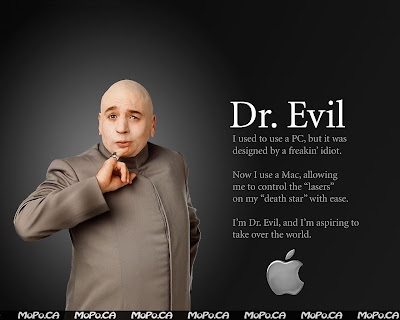
This ad's text also seems to be in Helvetica, like the other apple add. Bold, highlighted “Dr. Evil” gives even more importance to the picture of Dr. Evil that stands on the left. It’s simple, clean. Text looks like a short poem or thought by Dr. Evil. Colors of ad are also stylish and work well together. There is good color contrast.

The Ad's structure is also formal, like the other apple ad I chose for this assignment. I take from this that the formal structure adds to the simplicity and clarity of both advertisements. In terms of composition, I believe the ad is balanced and symmetrical. both “objects” in ad reference each other and because font is large in the text to the right of Dr. Evil, he looks of equal size as text. This makes us, the viewers, feel like he is as important as what he has to say about apple and PC. Both he, and the text, are in the foreground and in the background is “white space” that makes the message and his picture stand out. Direction is seems to me to be from left to right or right to left. 


I also liked this ad very much. It's witty and looks good.

Apple-PC Ad

the text of this ad is probably in helvetica font. the grey makes it stand in midground. it's clean. clear. little writing. image stands out more because of all the white space and the color of the text. the ad has a formal structure; there is even distribution of elements along implied axes.

in terms of composition: i see a perfect balance. white space accentuates both people on the ad and the balance their positions on the space create. there is symmetry. the tall, slim figure of the young man on contrasts with the size and height of the man on the left side of Ad. The viewer probably looks looks at him first, then at young man, followed by looking at the descriptions of "who they are" (the grey text). Both figures are in foreground and the letter seem to actually be bit in the background. direction goes from left to right and right to left. I think it's an excellent ad because it's simple and the message is clear and funny.